- Published on
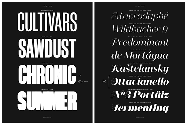
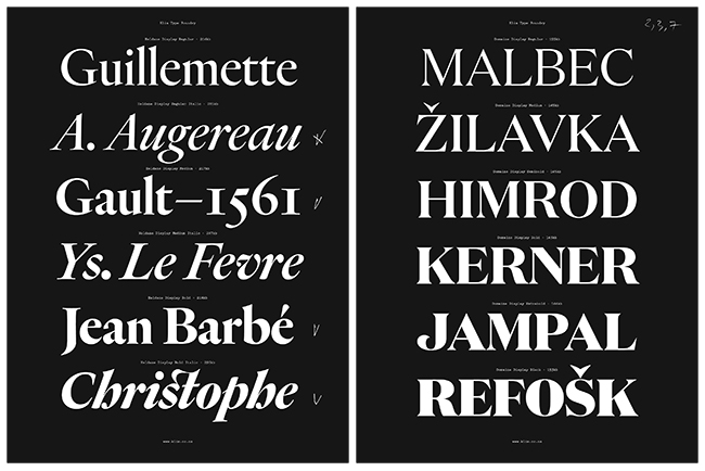
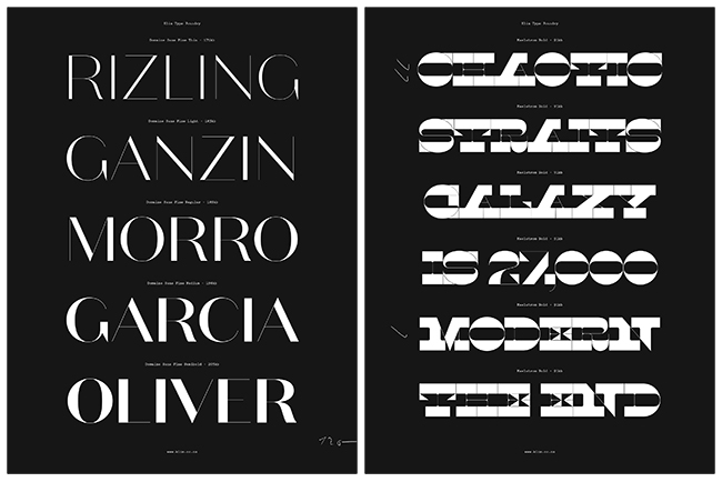
I am Kris Sowersby and I design typefaces. I run the Klim Type Foundry based in Wellington, New Zealand.
Does it make sense to teach yourself type design or do you need to go to college to get some basics? Tell us a little bit about your self taught approaches.
I don’t think you can come to typeface design without having any experience or basic training in typography itself. When I was at design school I realized that the foundation of all graphic design—including screen-based work—is typography. I became very interested in the letterform: the smallest unit of typography. From there, I copied existing typefaces in pencil to understand their nuances. I also tried to make my own (crude) typefaces, slowly learning about the systematic gestures, consistencies and deviations that comprise a typeface. I have to admit I’m not entirely “self-taught”. I received generous guidance and support from Christian Schwartz and Chester Jenkins in the first few years of Klim. I really did want to attend either Reading or t]m, but I had just graduated from design school and they were far away and quite expensive. So being self-taught was, I suppose, a necessity rather than a choice.
What makes typeface design so significant nowadays? Why do your clients attend to noticeable typography in their products?
Perhaps typeface design seems significant now because of the great number of people doing it? The financial and technical barriers to entry are relatively low, and the ease of sharing work via social networks permits wide exposure. The typeface market used to be dominated by a handful of companies, the propriety typesetting systems were expensive and specialized. Now that it’s virtually all digital, there is a wide array of choice and voices in the markets. The most interesting thing, for me at least, is the rise of multi-script designers outside the established companies. People making type from within their own cultures, rather than relying on outside suppliers.
As for my own clients, I think they see value in creating typefaces specifically for their own needs. Some typeface designers think we’re just filling in the gaps, but I disagree. I think we will always need new typefaces because there is no definitive form of the alphabet. The alphabet is a concept made concrete through countless written and designed letterforms; the alphabet is not defined by a single typeface but expressed through all of them. Typefaces speak of where a culture is, its priorities and aspirations. We no longer live in the same societies as our predecessors. The world-view of Giambattista Bodoni, for example, does not necessarily align with our own. This is what my clients understand, this is why they want and need new typefaces.
Could you describe a typical day of a type designer? What kind of work do you do every day and what are the most favourite tasks personally for you?
My typical day is rather quotidian I’m afraid! Food, emails, work, exercise: you get the picture. My favourite task is actually drawing typefaces, getting a specific idea to work is very hard but enormously satisfying.
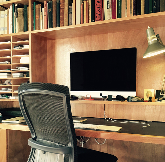
Where do you work and what does your studio look like?
I work from home in a modest office.
Who are the best typography designers in New Zealand / surroundings whose work you admire?
In alphabetical order:
-
Alan Deare/Area Design
-
Alt Group
-
Doublefish
-
Duncan Forbes
-
Jarred Bishop
-
Jonty Valentine/Index