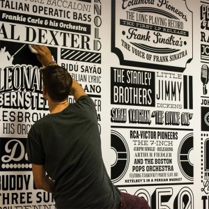
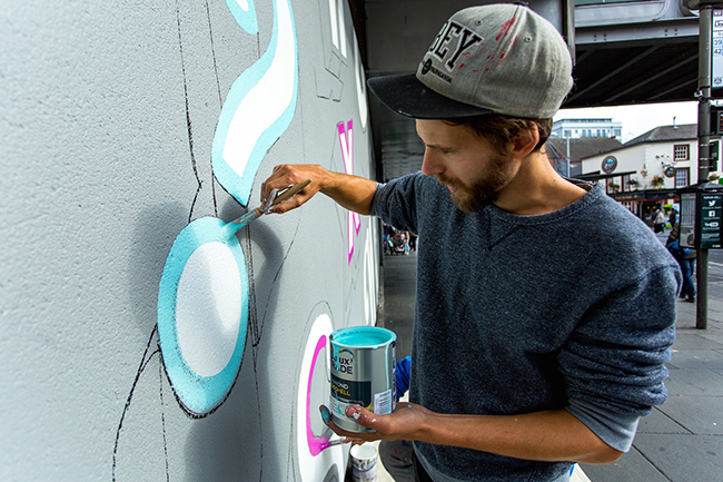
My name is Alex Fowkes I’m a 28 year old rather nomadic graphic designer, I'm based in lots of places around the UK depending on where the wind takes me, from the Midlands and London to Cornwall. At the moment I mostly create typographically led environmental graphics and murals, but I also create lots of other typographic work for various clients and brands. Anything from fashion to editorial and branding to packaging, I love to get down and dirty with paints and brushes, crafting something by hand has such an amazing calmness compared with this rapid online design industry.
Where did you learn the foundations of graphic design and typography? Are they two separate disciplines you must learn independently of each other or is it better to learn them as a whole?
At GCSE i always loved making things so for my A-Levels I took Fine Art, Graphic Design and 3D Design, all my eggs in one basket you might say. From there I took a foundation in Art and Design and Loughborough Uni and Finally a Graphic Design course at Nottingham Trent Uni where I graduated with a first class honours in 2010. I never really dabbled in typography till I was in my third year at uni, I was told I wasn’t concentrating or considered my type enough, so I made quite a few projects all about typography to really get to grips with it from there I never looked back.
I think they can be learned separately or together really, for me it was separate, I learnt about messaging, visual style, composition, layout, images, all those things before I got down to the details within the craft of typography, I suppose this way was good for me because that's the way I learn, If I try to do too much at once I can’t really see the end so I tend to lose interest fast and become distracted. I have to do it in little bits progressing one skill at a time and then combine them at a later date.
Your book ‘Drawing Type – An Introduction to Illustrating Letterforms’, is it all about knowledge and your rich experience in typography? What did you feel when it was published?
Drawing Type is more of a inspiration book than a work book. I have a little regret about have the subtitle as ‘An Introduction to Illustrating Letterforms’ I think it should have been 'Illustrated' rather than ‘Illustrating’ the workbook aspect is quite little and just a nice bonus to give people confidence with type who might not understand it. It's based on how I got to grips with type by tracing letterforms digitalising them and playing around with layouts. Predominantly its designers I look up to and enjoy, with an average them theme of playfulness and individuality.
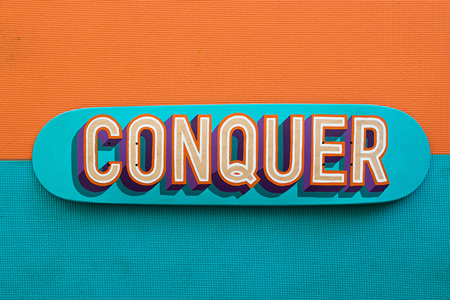
Would you tell about some lectures and workshops you've attended throughout the year? Do you think some people can learn all they need from courses and self studying ignoring academic education?
I’ve both given and received lectures and workshops to students and from professionals. Workshops included sign painting with Mike Myer and talks at Glug networking events. I think certain type of people can learn everything they need, but they have to be a certain type of person. They need to be confident in their ability, dedicated, self motivated and it always helps to be connected in some way or another. If you don’t have those qualities you might struggle. From a academic education point of view it gives you an amazing backbone of support for when you are learning. A good teacher will guide but not provide, allowing you to make mistakes and go through tough periods while still being there to provide help when it's needed. I was lucky enough to have tutors like that when I was studying.
What is the origin of your typography inspiration: other fonts, graphic works, real life around or something else?
I have many different inspirations within my work, I'm currently going through a transitional period where I want to push my skills and my work but finding exterior influences outside of the design industry. I'm trying to paint as much as possible at the moment, taken colour inspirations from nature and travelling. I want to install an ethos like that in my inspiration. After all the work you do in your spare time becomes the work you do for clients within a year or two, it's only natural if you are a progressive self motivated designer.
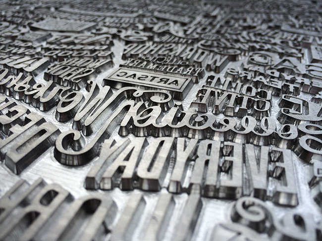
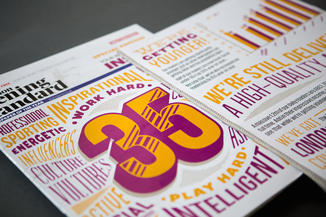
I suppose a lot of my type style actually comes from a state of mind within the illustration work I used to do. I always used to love repeat patterns and very detail heavy work, I used to draw patterns and fill pages with repeat geometric shapes. I then applied that state of mind to typography to come up with the work I have been doing for clients like Sony Music, O2, Toyota etc. I think it's important to be influenced by a totally separate industry or work process. It allows you to thing in new and interesting ways.
