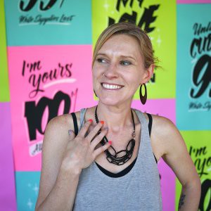
My name is Annica Lydenberg and I have been doing work under the name Dirty Bandits for over 10 years. I am a lettering artist, designer, illustrator and sign painter.
How did you get started in hand-drawn typography? What is a turning point in your professional career?
I decided I was interested in hand drawn typography long before I ever tried to make it my career. As a teenager working retail in a beautiful local bread bakery I spent most of down time between customers making signs for anything I could find around the bakery. It wasn’t until 15 years later that I found myself being hired by that same bakery to paint a series of signs for their windows.
In order to move away from animated banner ads and website design to become a lettering artist I wrote a break up letter to HTML that I posted on my site, turned over all files and sent a list of recommended web designers to virtually all my web clients. This cut my business drastically so I cut my expenses drastically and began doing personal projects to begin to fill in a new portfolio with the type of work I wanted to pursue.
What is your ideal work environment? Do you prefer to work in your design studio all day long or prefer to mix a few activities?
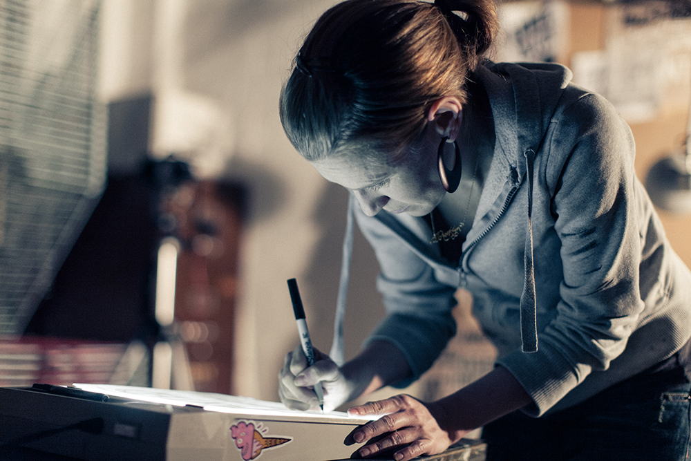
My favorite days usually start with sketching in a coffee shop for a half hour or so before the call of the Inbox becomes to great to ignore. Then I am lucky enough to go to a shared studio space full of other lovely, hard working freelance-y folks doing their thing. When it’s warm out I love an afternoon painting a wall outside with a friend too, but those days are special and rare.

What are your favorite typography books and resources?
I have been most heavily influenced by sign painting, tattoo artists and vintage signs so some of my favorite resources include lettering books from tattoo artist BJ Betts, sign painting zines from the PreVinylite Society, a tumblr full of old metal car logos chromeography.tumblr.com and an epic book called Storefronts by Jim and Karla Murray that shows NYC neighborhoods block by block in the early 2000s.
Where does your typography design inspiration come from?
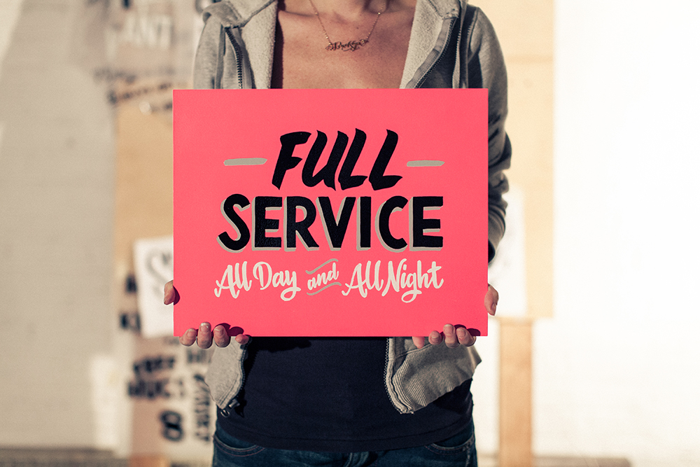
I’m constantly looking at lettering on everything I interact from toothpaste logo in the morning to the wine label in the evening but when I sit down to work on a new piece I do not start with lettering references necessarily. I like to first focus on how I would say the phrase, where the emphasis would fall, what the tone would be - then I use that to inform my decisions of how to move forward visually as opposed to just working in a style I want to explore. The most important thing is always how appropriate lettering is for the message and intent of the copy.
Who are the typography designers you admire most?
There are so many interesting and lovely people out there in the type world and I love what I see every day in my instagram feed from people. These are a few of my favorites:
- Niels “Shoe” Muelman make me drool, his stuff is so sick.
- TJ Guzzardi, so good it depressed me, but then inspires me again - I will never be this good
- Gemma O’Brian from Sydney is supremely talented
- George Anzaldo, getting better every day
- Nim Ben-Reuven, super humble and super scripty!
- Faust, did a whole series of script in the snow… love it!